Note: Please view the related Pen for this post: Auto-filling Charts with Chart.js
Note: You must be familiar with the Line Chart Introduction to understand this post, but it’s a very quick and simple read.
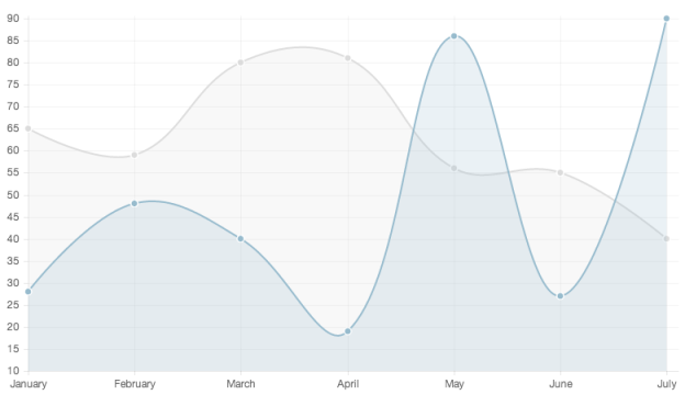
Chart.js is a simple yet feature-rich JavaScript library for embedding charts and graphs in websites. Recently, the authors of Chart.js added a responsive setting that redraws charts by width, but the charts are locked to the original aspect ratio of the canvas. That almost fit the bill for a project at work, but I wanted the chart to always fill its region regardless of the original aspect ratio. Unfortunately, this isn’t supported out of the box.
Fortunately, it’s easy to implement your own auto-filling responsive charts. I’ve put an example together in this Auto-filling Charts with Chart.js Pen (not embedded due to wordpress.com restrictions).
The key to this functionality is the setChartDimensions() function combined with the window’s resize event. setChartDimensions() calculates the height and width of the region the chart should fill and sets the canvas’ width and height attributes to those values. With jQuery, that’s straightforward:
function setChartDimensions() {
  var width = $("section").width(),
      height = $("footer").offset().top - $("canvas").offset().top - 20;
  if (currentChart) {
    currentChart.chart.aspectRatio = width / height;
  } else {
    $("canvas").attr("width", width);
    $("canvas").attr("height", height);
  }
}
This function should be called before creating the chart and whenever the window is resized. On resize, rather than recreating the graph, refresh it with the built-in Chart.js functions:
$(window).resize(function() {
  if (currentChart) {
    setChartDimensions();
    currentChart.stop();
    currentChart.resize(currentChart.render, true);
  }
});
When you create your chart, save it in a variable that’s accessible to both the resize handler and setChartDimensions(). I’ve done that in the Pen with the currentChart variable. Good luck!